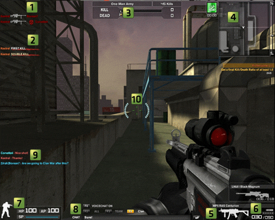
Everything from the radar to the accolades was changed in order to match the shininess, sleekness and polish that was smothered all over GUI. Since pictures speak a thousand words, and a lot of bad things has been said about the update, the post will mostly consists of this technology.
 | ||
| The Inteface Guide of 2008 |
 | |
| The Interface Now |
 | |
| Quality Assurance? What Quality Assurance? |
 |
| This had an exclamation mark on the Patch Notes so I decided to feature it here. New splash screen! |
 |
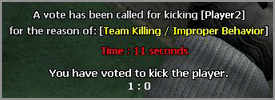
| Vote Kick |
 |
| Vote Kick Now |
 | |
| Kill Cam |
 |
| Kill Cam Now |
 |
| Score Board |
 |
| An unbelievable that you would notice |
 |
| An unbelievable that you wouldn't since they all look the same. |
 |
| Map Loading Screen |
 |
| Map Loading Screen Now |
It is unknown what Nexon is going to do with the HUD apart from the fix the bugs, but they are collecting feedback at this thread: http://forum.nexon.net/CombatArms/forums/thread/5530402.aspx
Update 28th August
The team you are currently on is now highlighted in blue.
Feel free to leave screenshots of the old / new HUD for parts the I've left out.
Question of the Post
Which HUD do you prefer?
Do you think the HUD suits Combat Arms?
Did you know?
On launch of Vivox Voice Chat it took about 30 minutes for the Vivox servers to crash. It took several months until the service was stable enough for the whole game to be connected.


I'm still here checking back every day! =]
ReplyDeleteI prefer the old HUD, although the new one suits the current UI better. But overall I still prefer the old UI!
Thanks for the visits! =P
ReplyDeleteI don't think I'll have many articles posted anytime soon since I've probably touched upon most of the events... except for specific people and hacking which are touchy topics.
omg!! looks so good this new hud, but I dont seem to have it... PLZZZ TELL ME WHY??
ReplyDeleteit looks so good,
These screenshots of the new HUD are from when it first came out. Thanks to many complaints, mainly from forum user Klypto, some parts now look different (better).
ReplyDeleteWhich parts of the new HUD from these screenshots do you like better than what we have now?